Tuesday, August 10, 2021

How to Use Hierarchical Styles in SwiftUI with Colors


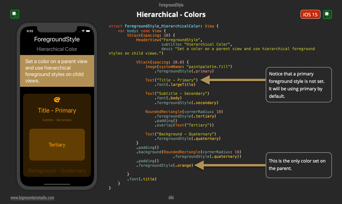
SwiftUI has 5 different style categories. Hierarchical styles are one of the categories. They can be used with or without color.

Without color these hierarchical styles use variables of black and white (for light and dark modes). You have seen this with the default text, SF Symbol and Shape colors. They use the primary hierarchical style.

Well, you can also use variations of color, not just black and white.

Start by adding a color to the parent view using:
.foregroundStyle(Color.orange)

Then when you use one of these hierarchical styles, they will use a variation of that color:


  • .primary

  • .secondary

  • .tertiary

  • .quaternary


Take a look at the example:


foregroundstyle.hierarchical.colors.png

Monday, August 9, 2021

How do you use Hierarchical styles in SwiftUI?

In SwiftUI, starting with Xcode 13, you can now apply hierarchical styles to your UI.

These styles are meant to show importance to different levels of your UI by making them stand out more or by showing levels of depth.

You probably do this already in some way. You give UI views in the background less color or more transparency and UI views in the foreground have more opacity (solidity) and might use more color.

And finally, you have your accent color which stands out the most so users know that they can interact with these UI views, like buttons.

Now, you can use hierarchical styles to help you with this pattern.

There are 4 styles at this time:

  1. Primary - More in the foreground
  2. Secondary
  3. Tertiary
  4. Quaternary - More in the background

You apply these styles to views using modifiers such as:
  • background
  • foregroundStyle

Take a look at the image for example:
 
foreground.hierarchical.png

Note: These examples come from a book called SwiftUI Views Mastery which is a picture book reference of SwiftUI views and code that’s almost 1,000 pages.

Interested in beginning SwiftUI?

Start with the free SwiftUI Views Quick Start picture book!

Wednesday, August 4, 2021

How do you use foregroundStyle or background to add blur effects in SwiftUI?

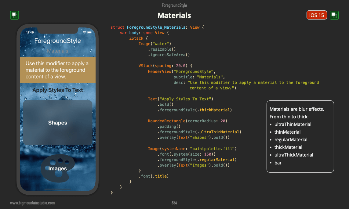
In Xcode 13 you now have access to a variety of blur effects also known as "materials".

Materials are one of the 5 categories of styles that can be applied to views using modifiers such as foregroundStyle and background.

The 5 SwiftUI Styles Categories include:

  1. Color

  2. Gradients

  3. Materials

  4. Hierarchal

  5. Semantic


When you apply a material to a view, you have a choice in how transparent and blurred the view is.

Here are 6 materials available to you:

  1. ultraThinMaterial

  2. thinMaterial

  3. regularMaterial

  4. thickMaterial

  5. ultraThickMaterial

  6. bar


Here are some examples of how to apply these materials to different views:

Text("Apply Styles To Text")
    .bold()
    .foregroundStyle(.thickMaterial)

RoundedRectangle(cornerRadius: 20)
    .padding()
    .foregroundStyle(.ultraThinMaterial)
    .overlay(Text("Shapes").bold())

Image(systemName: "paintpalette.fill")
    .font(.system(size: 150))
    .foregroundStyle(.regularMaterial)
    .overlay(Text("Images").bold())

Are you new to SwiftUI?
Go here to get a free SwiftUI Views Quick Start book.


foreground.materials.png
Note: These examples come from a book called SwiftUI Views Mastery which is a picture book reference of SwiftUI views and code that’s almost 1,000 pages.

Interested in beginning SwiftUI?

Start with the free SwiftUI Views Quick Start picture book!

Tuesday, August 3, 2021

How do use foregroundStyle to apply gradients to SwiftUI views?

In SwiftUI (Xcode 13) you can use the foregroundStyle modifier to apply gradients to views such as Text, Images, and Shapes.


RoundedRectangle(cornerRadius: 20)
    .foregroundStyle(.conicGradient(colors: [.green, .blue], 
                                    center: .center))


In this image, you can see foregroundStyle being used to apply the new conicGradient.

The conic gradient is a lot like angularGradient

What's different is you can adjust the angle with just one parameter.

Check it out:

conic.gradient.intro.png

conic.gradient.angle.png
Note: These examples come from a book called SwiftUI Views Mastery which is a picture book reference of SwiftUI views and code that’s almost 1,000 pages.

Interested in beginning SwiftUI?

Start with the free SwiftUI Views Quick Start picture book!

Monday, August 2, 2021

What new colors are available in SwiftUI in iOS 15?

With the release of Xcode 13, we see that some new colors are now a part of SwiftUI.

These colors were previously a part of UIKit but were not native to SwiftUI yet.

The colors are:

  1. Mint

  2. Teal

  3. Cyan

  4. Indigo

  5. Brown


So what do you think? See any colors you will be using?

Get your free SwiftUI Views Quick Start book.


color.new.png
Note: These examples come from a book called SwiftUI Views Mastery which is a picture book reference of SwiftUI views and code that’s almost 1,000 pages.

Interested in beginning SwiftUI?

Start with the free SwiftUI Views Quick Start picture book!

SwiftUI Search & Filter with Combine - Part 3 (iOS, Xcode 13, SwiftUI, 2...

In part 3 of the Searchable video series, I show you how to use Combine in #SwiftUI for the search and filter logic connected to the searcha...